This article was written for Level Renner
It appeared in the September/October 2016 issue - page 38. .
click on figure to get full size
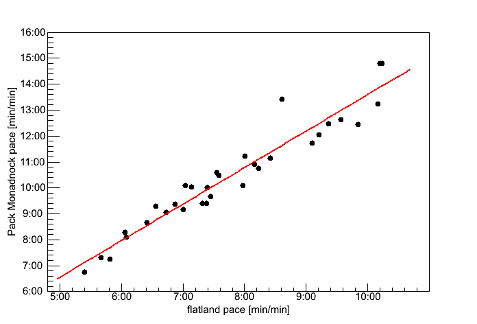
Fig 1. Correlation between flat-land pace and Pack Monadnock Pace.
Runners on Pack Monadnock ran at about 70% (the slope of the red line is 0.7) of their pace for flatland races. But those flatland race included a number of short races too.
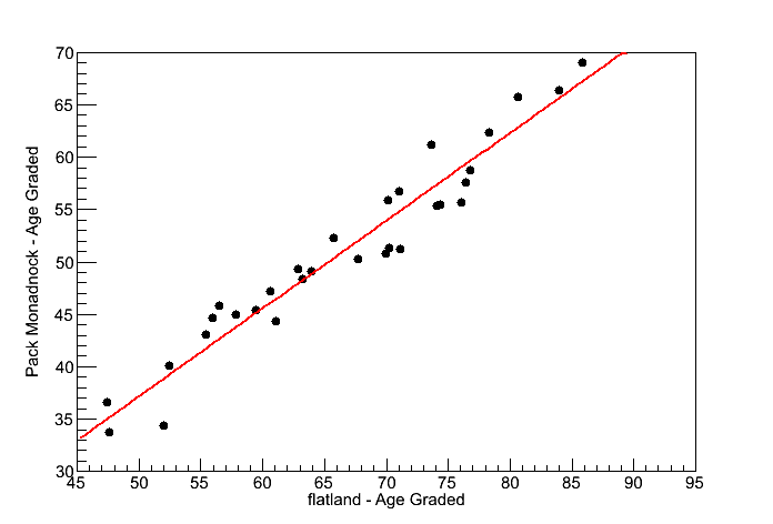
Fig 2. Correlation between flat-land Age Graded scores and Pack Monadnock Age Graded scores.
Runners on Pack Monadnock scored about 84% (the slope of the red line is 0.84) of the age graded score they got on the flat.
If you look at the energy in the table with Fig 3.(below), the ratio of Flatland-energy to Pack-Monadnock-energy is 3.60/4.34 = 0.83 = 83%.

Fig 3. Energy Cost as a function of incline.
This is how the sports physiologist describe the effect of hill. The curves are based on measurement of people running and walking on treadmills. I included the walking curve to show that walking is more efficient then running (calories per mile), and also because sometime all of us do walk.
Note: The curve is in units of "J/ (kg m)", which is "energy/(mass*distance)". The amount of energy need is directly propostional to the mass of the runner, and the distance traveled (no surprise).
| Race | Average Incline | J/ (kg m) |
|---|---|---|
| flatland | 0 % | 3.60 |
| Pack Monadnock | 3.5% | 4.34 |
| Mt. Washington | 11.7% | 6.44 |
Reference:
Energy cost of walking and running at extreme uphill and downhill slopes
Minetti AE1, Moia C, Roi GS, Susta D, Ferretti G
J Appl Physiol 93: 1039-1046, 2002
http://www.ncbi.nlm.nih.gov/pubmed/12183501
http://jap.physiology.org/content/93/3/1039
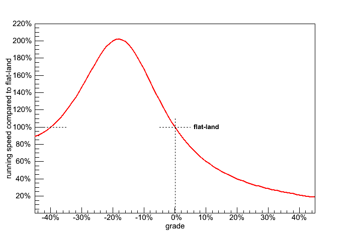
Fig 4. Expected change in speed due to grade based on the energy cost.
This says that your fastest run is with a 20% (1 in 5) downhill. Steeper that that you spend energy catching yourself. People who hike down mountains know all about this.
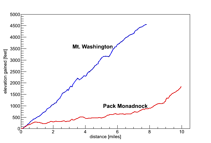
Fig 5. Elevation Grain profile for Mt. Washington and Pack Monadnock.
Mt. Washington is a long grind. But the very last section of Pack Monadnock is actually steeper.
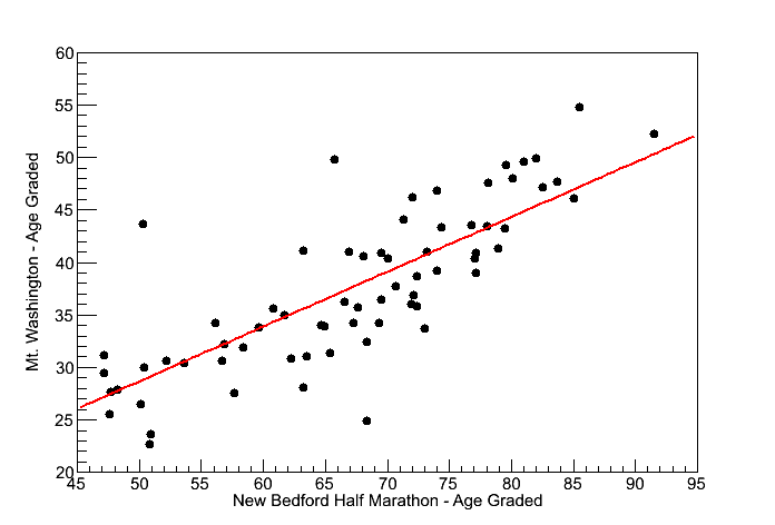
Fig 6. Correlation between the New Bedford Half Marathon Age Graded scores and Mt. Washington Age Graded scores.
The slope of the correlation line is 0.556 of 55.6%
If you look at the energy in the table with Fig 3. (above), the ratio of Flatland-energy (New Bedford) to Mt.-Washington-energy is 3.60/6.44 = 0.559 = 55.9%.
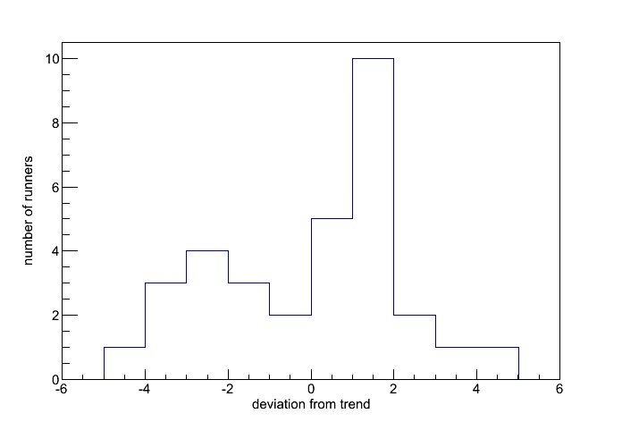
Fig 7. Deviation from predicted for the Pack Monadnock race.
This is based on Fig 2. (Correlation between flat-land AG and Pack Monadnock AG). The runners to the right of zero are above the line and ran slightly faster then the energy curve would predict. The runners to the left of zero are below the curve and ran slightly slower then the energy curve would predict.
Mt. Washington vs. An Ras Mor 5k

Correlation between the An Ras Mor 5K Age Graded scores and Mt. Washington Age Graded scores.
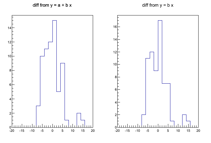
While writing the article I also created this plot, a comparision between Mt. Washington and An Ras Mor 5K performance. I didn't include it in the article for a number of reasons. First, there were 49 runners who ran both those races, which is about half as many as ran New Bedford (91 ran Mt. Washingon and New Bedford), so I had less statics.
The red line which is fitted to the data has a slope of 0.65 (65%) but it also has an intercept of -7%. Ideal the intercept would be zero, and so it is an indicator of how linear the fit is (Fig 1, 2 & 6 have intercepts of about 2%).
The blue line is fitted with the intercept fixed to zero. It has a slope of 55%, which agrees with the energy curve, but the reasoning is more complicated.
So in the end I decided that maybe the comparison was too complex for a brief article. How do you compare a race which is won in 15:42 to one which is won in 58:17?
More about figure 6 - Mt. Wasington vs. New Bedford
Here is a question posted by Will Smith (yes my son - he a numbers sort of guy too)
What happens if you compare their performance to the 55% GAP prediction, rather than the average of runners in that race? If they are all mountain goats, I'd expect them to consistently beat that prediction.
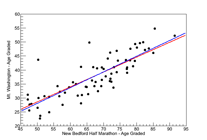
red line: y = 2.04 + x*55.6
blue line: y = x*56.1
First, as reported above, the red line slope is 0.556 (55.6%) whereas the energy curve would predict 55.9%. So in fact the runner perform slight worse then the energy curve prediction. I also tried a fit which required the line to go through zero (blue line). In this case the slope is 0.561 (56.1%) so slightly better. In either case maybe my statement, "Everyone who ran The Rockpile wanted to be there. They were all Mountain Goats." is not too strongly supported.
Or it could be that energy consumption for a one to two hours just dosn't exactly fit what was measured on a treadmill in a few minutes.