click on figure to get full size
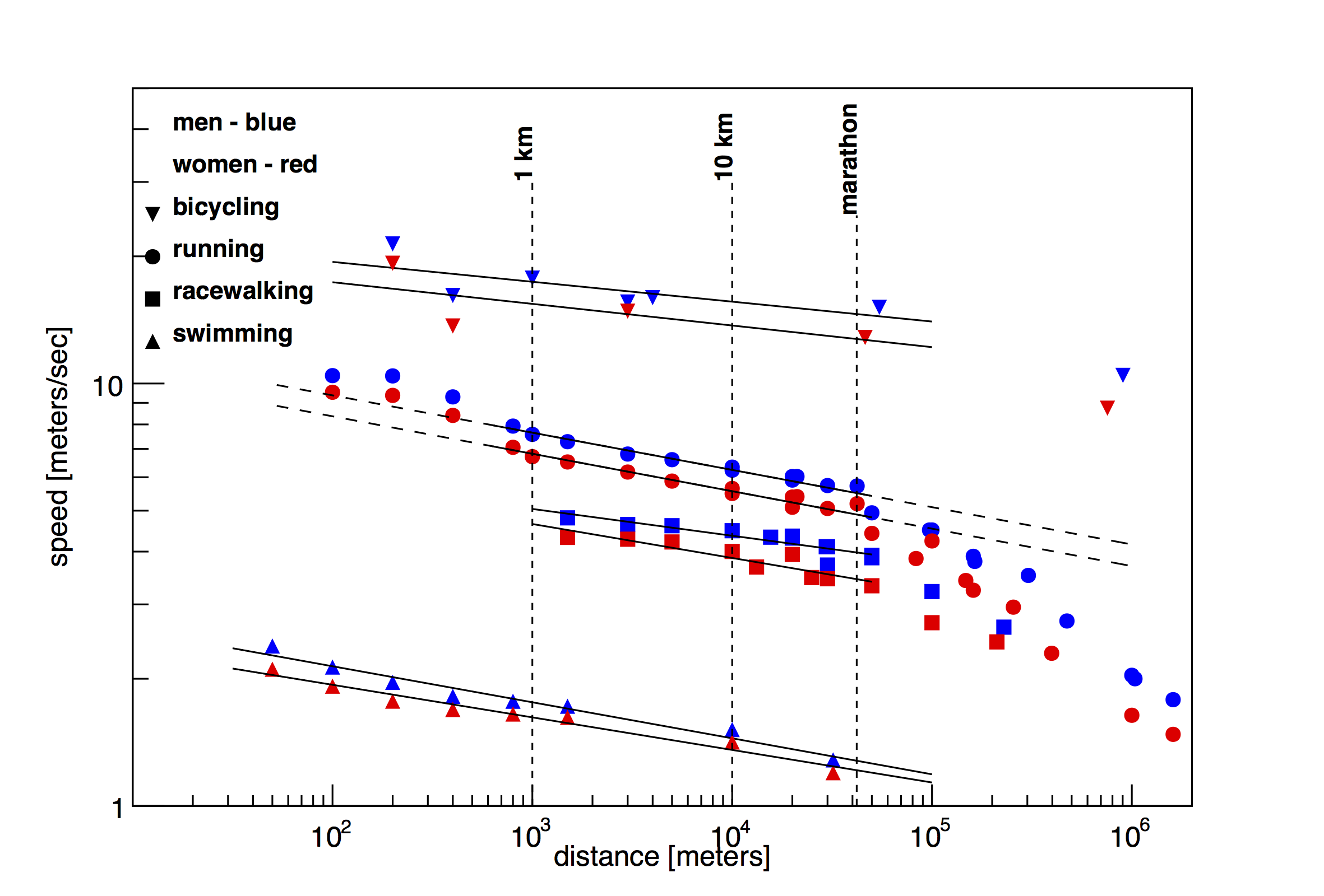
Fig 1. World records (or best performances) for various running, racewalking, swimming and cycling events. When you plot data on a "log-log" scale, the slope is proportional to the "power" by which we slow down.
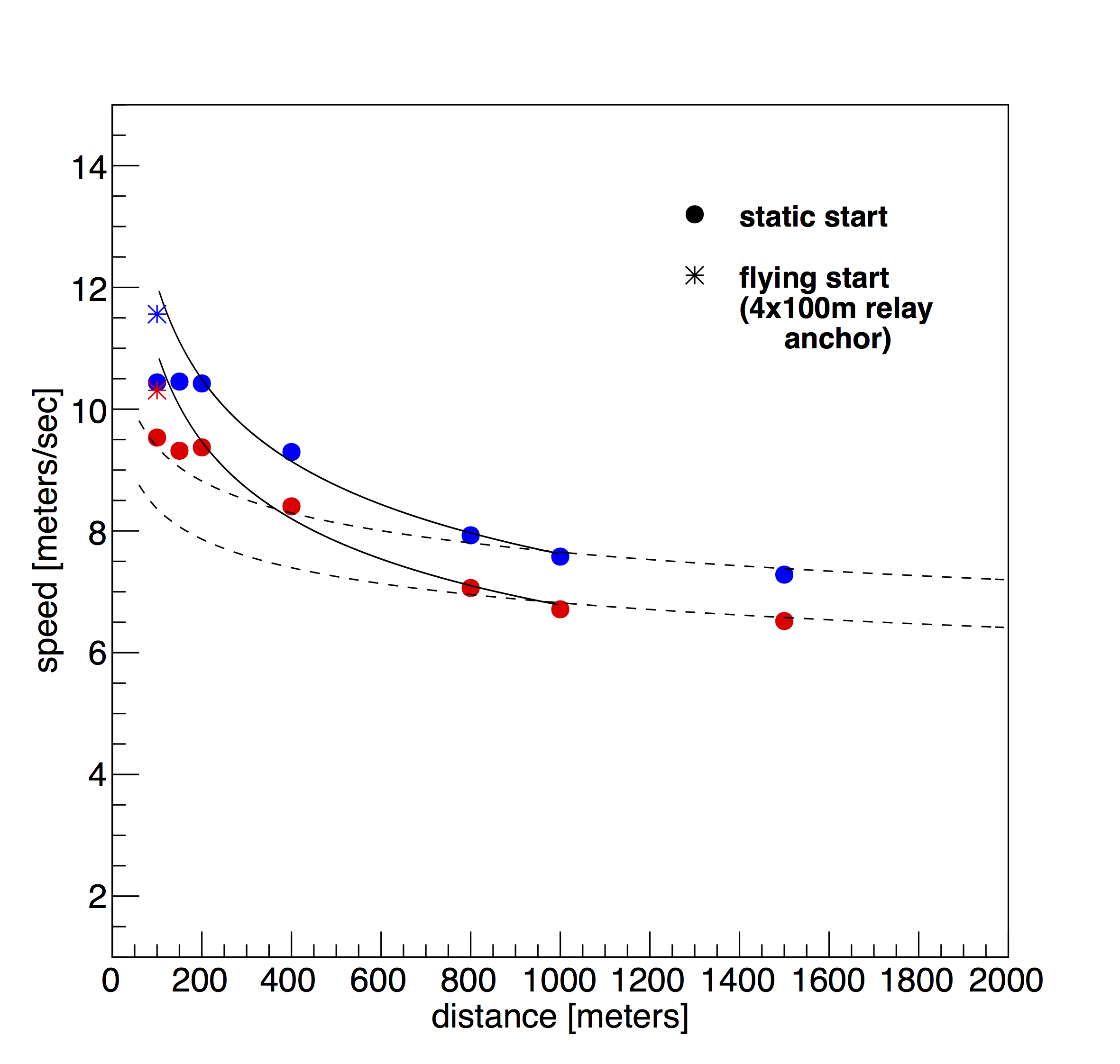
Fig 2. World records for 1500m and less on a linear scale. The dashed line is the fit from figure 1. The curve is fitted to data below 1000 meters. In this plot we are looking at the transition from anaerobic to aerobic. I have also added the anchor legs of the 4x100 meters, which are truly the fastest people have run.
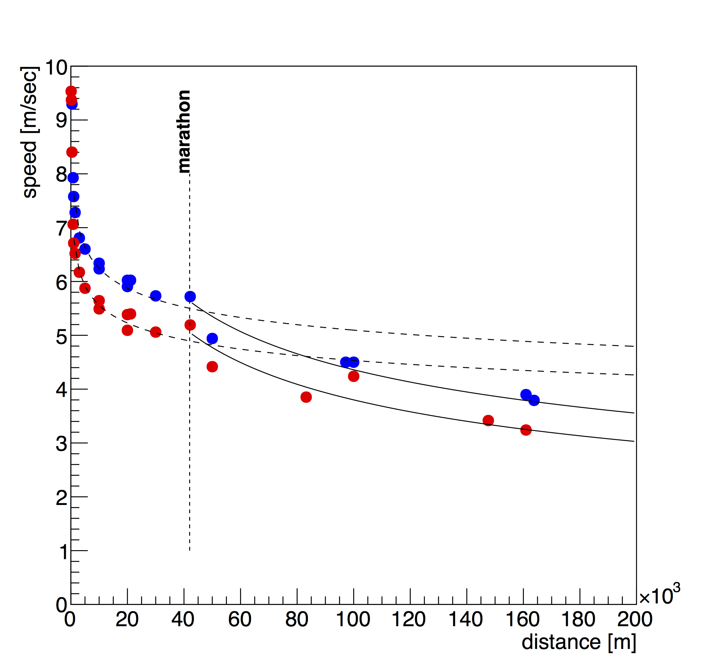
Fig 3. World records from 200m to 200 km. There are two places where the data jumps off the curve. First, women's and men's marathons are significantly above the curve. I expect that this is due to the prestige and prizes related to marathons. The second point of significants is Tomoe Abe's women's 100km in 6:33:11 in 2000. I don't think I realized how extraordinary her race was until I saw it plotted this way.
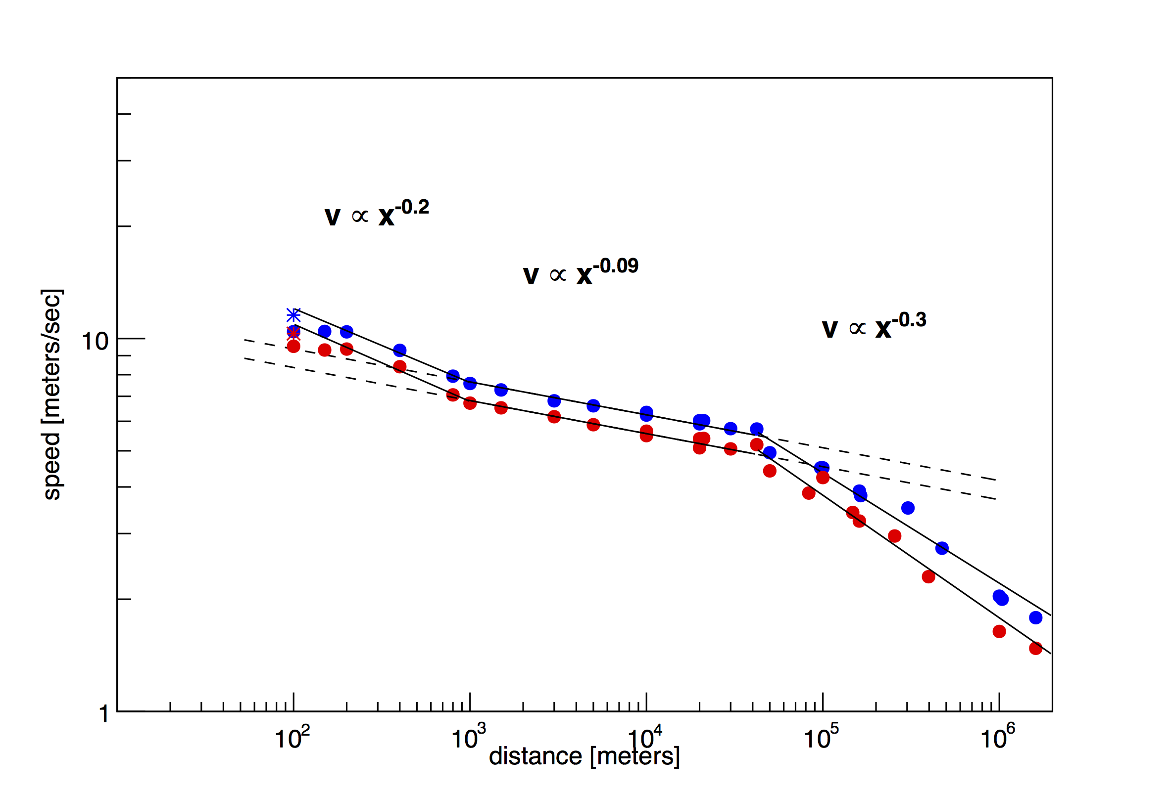
Fig 4. World records (or best performances) for running (same is figure 1), but with the fits for sprints, middle distance and ultra marathons plotted. World record speed are proportional to the distance raised to the power of -0.2, -0.09 or -0.3.