(click photos and figures to get full size.)

"If you know how to read splits, you can see challenges, surges, kicks, a bunching of the pack, crushed spirits, and even the thrill of victory."
The challenge is to take a table of split times and reconstruct the whole race. I created a few plots, and then picked the ones which I think best told the store of the race.
 1 Isaac Garcia-Cassani       0:32.780 1:04.297 1:36.175 2:07.728 2:39.380 3:08.960 3:38.940 4:07.761      #8
 2 Joe Coffey                 0:32.499 1:04.012 1:35.789 2:07.448 2:39.254 3:09.876 3:39.030 4:08.283      #7
 3 Donson Cook-Gallardo       0:32.193 1:03.490 1:35.353 2:07.310 2:39.252 3:09.759 3:39.278 4:08.538      #3
 4 Roberto Lara               0:32.776 1:04.040 1:35.903 2:07.731 2:39.485 3:10.009 3:39.412 4:08.576      #1
 5 Owen Norley                0:32.628 1:04.141 1:36.085 2:07.969 2:39.892 3:11.154 3:40.721 4:09.130      #5
 6 Jeremy Hernandez           0:33.124 1:04.488 1:36.349 2:07.850 2:39.473 3:09.401 3:39.415 4:09.999     #10
 7 Sean Bjork                 0:33.547 1:04.909 1:36.492 2:08.127 2:39.766 3:10.007 3:39.682 4:10.050      #9
 8 Daniel McSolla             0:33.205 1:04.869 1:36.884 2:08.503 2:40.029 3:11.156 3:40.893 4:10.200      #4
 9 Joe Zack                   0:33.221 1:04.660 1:36.769 2:08.505 2:40.360 3:11.096 3:41.065 4:10.206      #2
10 Mason Hepner               0:32.884 1:04.426 1:36.497 2:08.482 2:40.735 3:12.318 3:42.791 4:12.729      #6
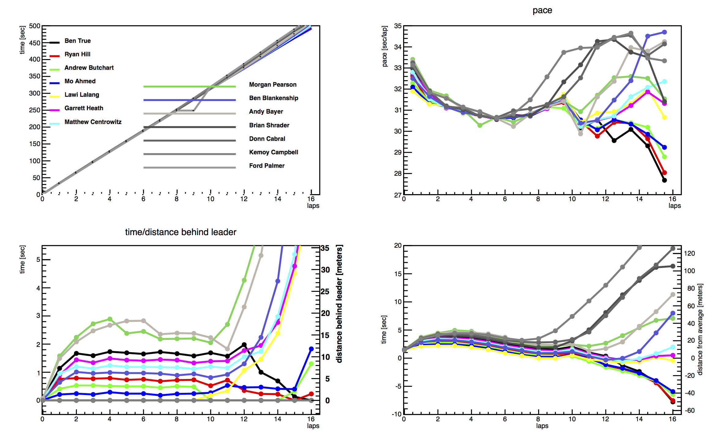
Every line represents a single runner and the colors are consistent within the mile race and within the Millrose two mile. Also on all plot the horizontal line is the distance in units of lapes. On the mile plots the race actually starts at 9.35 meters before the 0 lape.

- Upper Left - Time vs. Distance The slope of these lines is the speed of the runner. The fact that they are all close to straight and on top of each other tells us that all runners ran very close to the same speed.
- Upper Right - Pace This plot is Fig 1 in the article and repeated with details below
- Lower Left - Time Behind Leader This is what you would have seen if you saw a series of still photos of the race. It tells you who leads, and how far the other runners are behind. But it doesn't tell you if the race is getting faster or not.
- Lower Left - Time Behind Average Runner This plot is Fig 2 in the article and repeated with details below

Figure 1 NCAA Division III Indoor Track Championship Mile 2017. The pace of each runner through the whole race. A pace of 29.83 seconds per lap is a 4-minute mile.

Figure 2. The position of each runner relative to a ctitious runner who ran an even pace and average time. In this we can witness the dynamics of the race.

The same as the Original Mile plot.

Figure 3. The Millrose Games 2017 Two Mile